
As part of a collaboration between the Museum of Fine Arts in Boston, Experience Design Lab and the Co-Lab for Data Impact we developed two data visualizations to complement the visitor experience at the museum’s new Center for Netherlandish Art galleries to be inaugurated on November 20, 2021.

The two visualizations are based on datasets hosted by the Netherlands Institute for Art History (RKD) in The Hague on Dutch and Flemish artists and artworks. These datasets have been compiled over several decades, continue to be updated, and currently contain information on 374,330 artists and 258,832 works of art from the 15th century to the present day. The dataset is based on ongoing historic research for which not all parts are equally complete. The raw datasets are ontological – networks of concepts interconnected by relations – and had to be converted to a linear time-based data-narrative. Using custom algorithms, we extracted 46,038 artworks from 1,932 artists centered around the 17th century and that contain sufficient information for the two visualizations.
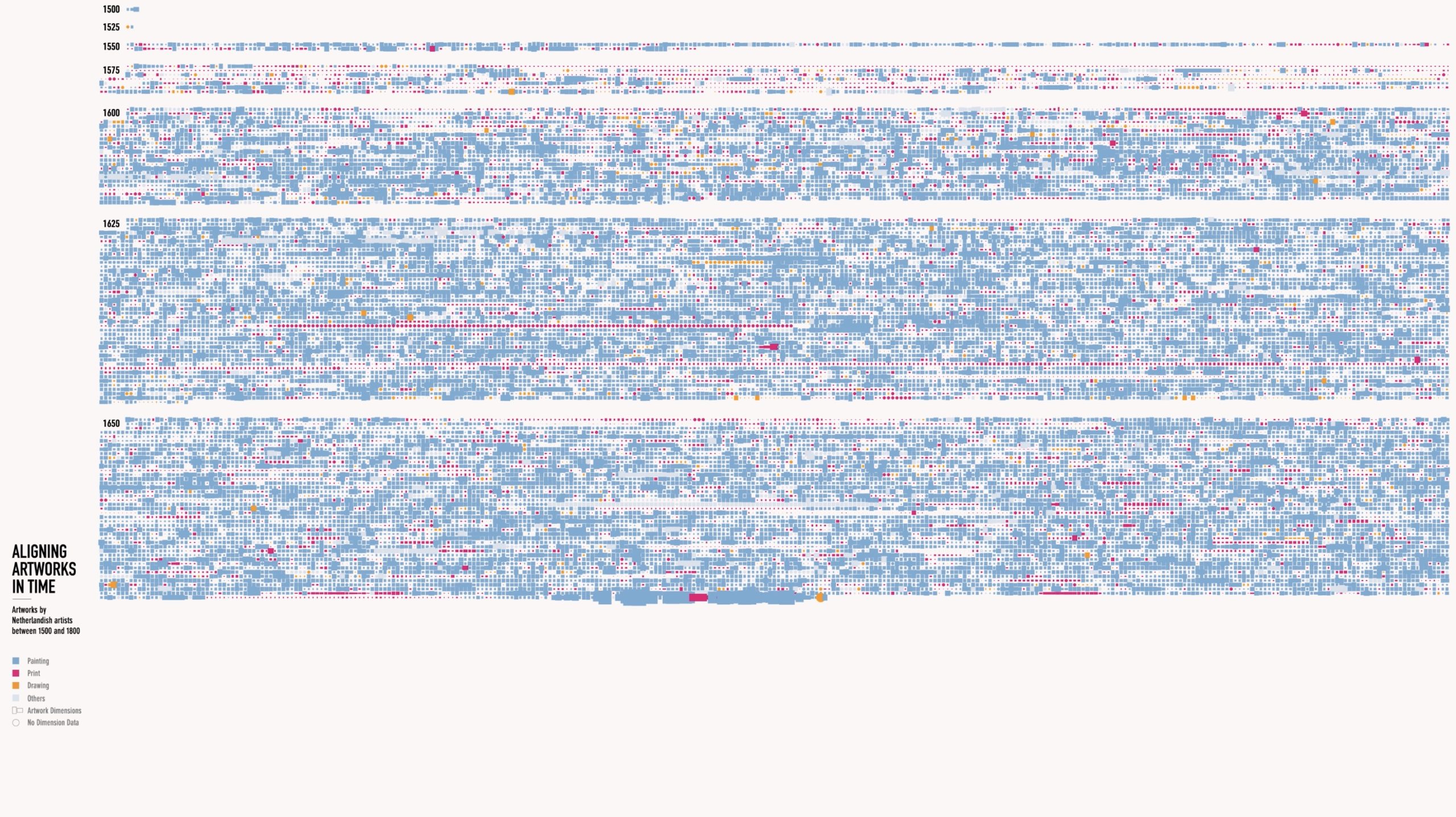
Aligning Artworks in Time
Aligning Artworks in Time focuses on the immense volume of works of art produced in the Dutch Republic from the late 16th through early 18th century. The visualization consists in an adaptive timeline: instead of plotting data points on a linear, equally spaced timeline, the timeline elongates and compresses depending on the volume of artworks produced in every year. Every square represents one artwork and the overall volume of artworks is subdivided in 25 year segments. Those segments with more artistic production are hence larger. Color distinguishes between different types of artworks and the rectangle ratio is based on canvas dimensions when available.
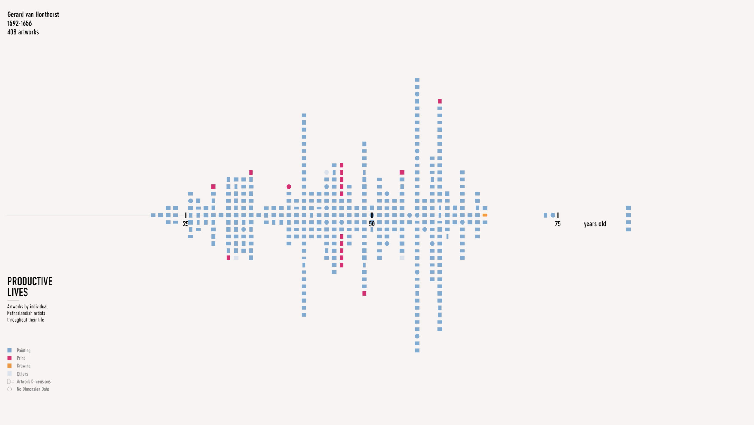
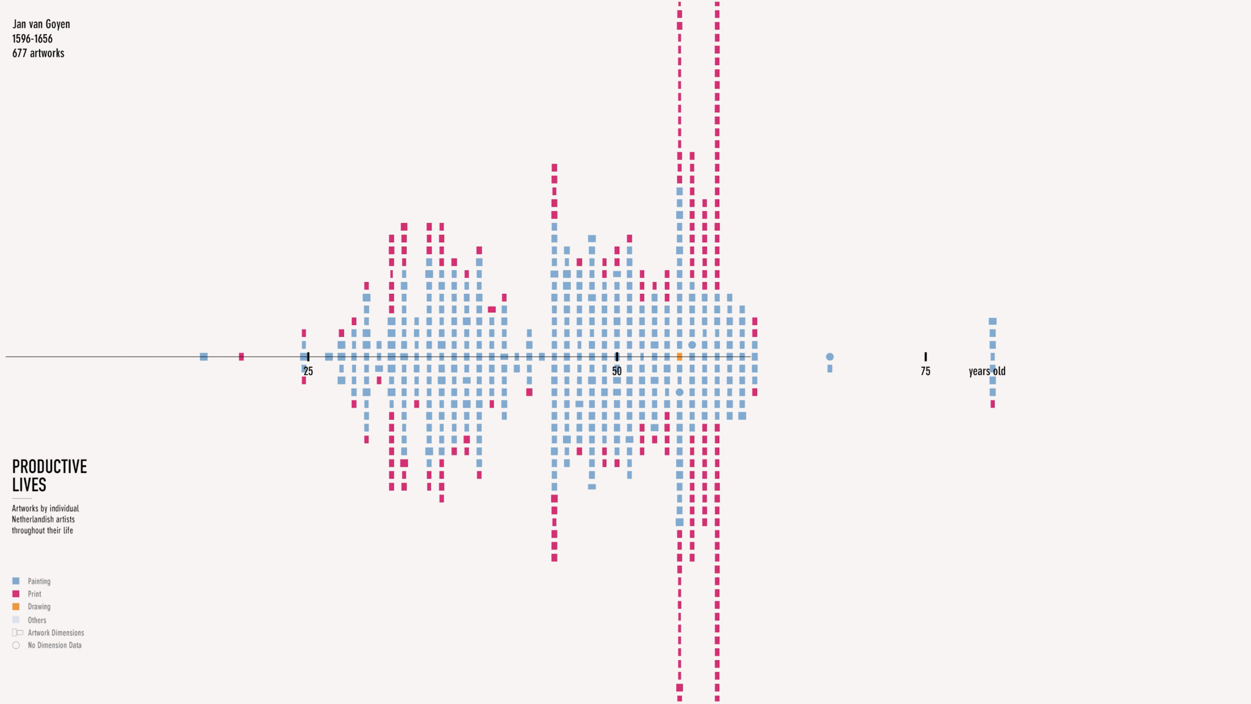
Productive Lives


Productive Lives offers a view of individual artists and the number of artworks they produced over the course of their careers. Artworks are stacked vertically at every year of an artist’s life. The visualization is animated as a flipbook, quickly passing through all the artists, slowing down on some artists of particular interest. The animation reveals the diversity in productivity among the artists, allowing for more detailed examination of the productive lives when the animation pauses.
The two visualizations work together and help us understand the density of the market and how artists developed different strategies for navigating the competitive environment.
The data visualizations were created by faculty and graduate students from Northeastern University’s Experience Design Lab and the Co-Lab for Data Impact, in consultation with the Center for Netherlandish Art and the Netherlands Institute for Art History.

Team
Kristian Kloeckl, Pedro Cruz,
Shan Wei, Niyati Vijay Kothari
Partners
Museum of Fine Arts, Center for Netherlandish Art
Netherlands Institute for Art History (RKD)