As part of the ‘Northeastern Energy Flows’ research project this interactive data visualization system provides access to fine grain data on energy consumption, building occupancy, climatic conditions and social activities. Like a musical notation for orchestra, the data rows of the system (like the staffs for different instruments) in conjunction with the map allow to explore multiple dimensions in parallel. This helps in obtaining a deeper understanding of the dynamics related to energy consumption, to foster engagement across disciplinary boundaries and to support decision making. The project currently uses the Northeastern University campus in Boston as a ‘city-in-a-city’ testbed.
An emphasis has been put on not only focusing on energy data alone, but to explore how a better understanding of dynamics related to energy consumption can be revealed by connecting data from multiple domains. That is, complementing data from the techno-sphere (energy data) with data from the socio-sphere (room occupancy, events and academic calendar, twitter data as proxy for social activity) and from the bio-sphere (weather data).
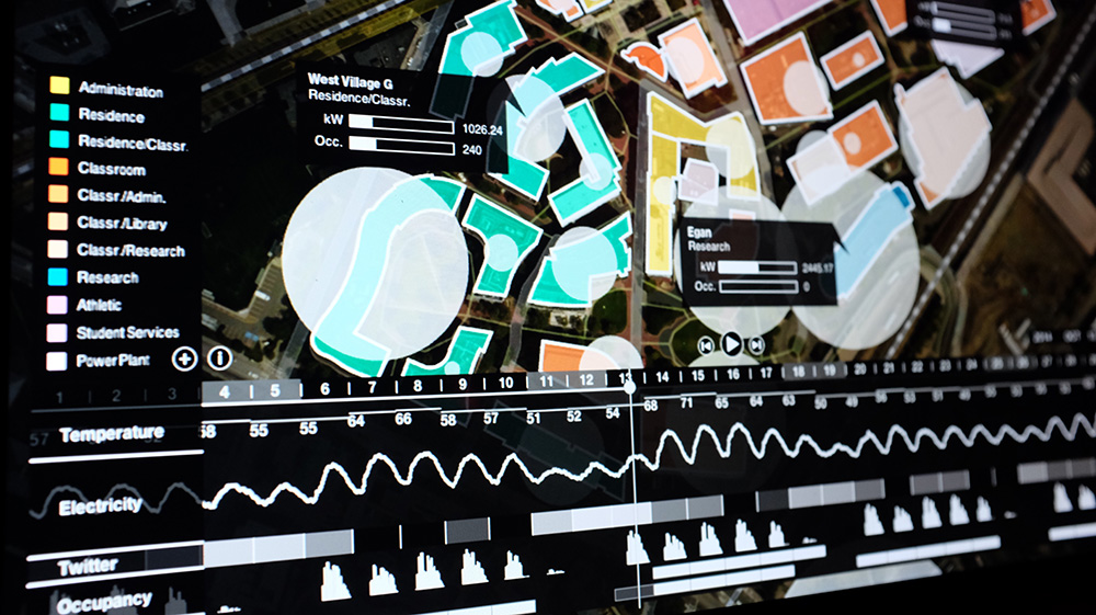
The data driven visual interface we developed consists of two distinct visual areas: a map area with data overlay in the upper half and what we call a data-score area in the lower half.
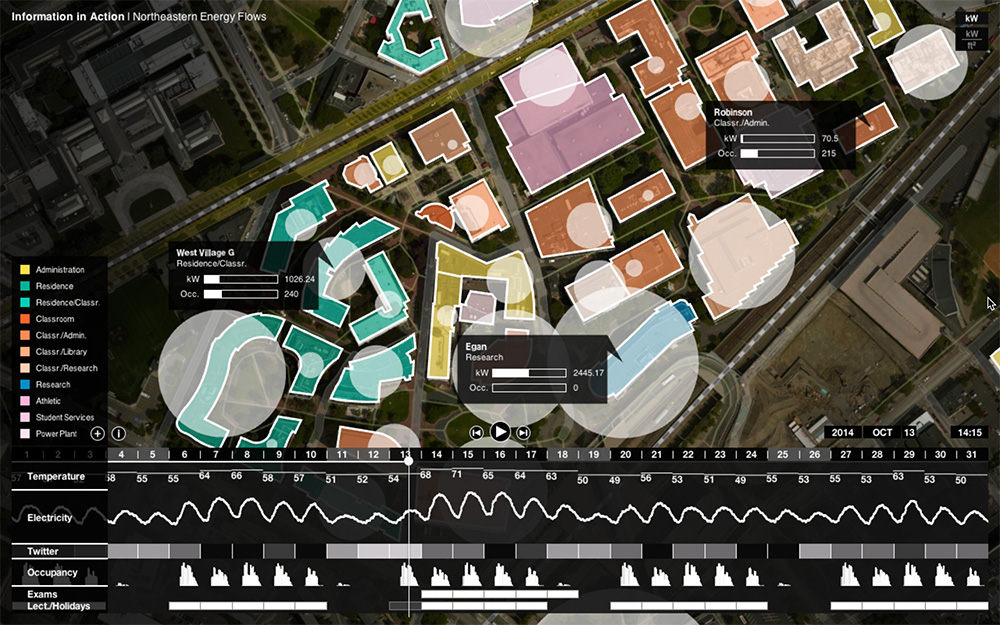
1) Data-score area: The data-score area is inspired by the score structure of sheet music in musical notation for ensemble. In musical notation for multiple voices each voice is written on one five lined staff with multiple staffs connected by a vertical bracket that illustrates functional groupings of voices that function as a unit. On the left of each staff a label indicates the type of voice/instrument and at the beginning of the staff the clef indicates the pitch. In line with these conventions, our system proposes multiple data staffs, each representing data from a specific source in order to afford a parallel reading of dynamics from a diverse set of realms (socio-, bio-, techno-sphere). This data- score section is designed in a modular way allowing for different data types to be flexibly combined. It currently contains rows representing these data types: aggregate campus-level electricity consumption, ambient temperature (dry-bulb), aggregate planned campus classroom occupancy, academic activities, Twitter activity.
2) Flexible data-score combination: The purpose of this setup is to afford a parallel reading of data from different sources and contexts in order to visually explore possible correlations. While the establishment of correlations does require deeper analysis over bigger time frames, the challenge of any data analysis is the formulation of meaningful questions to begin with. It is to this point that this data visualization system aims to contribute and to stimulate exploration of multiple data dimensions to explore starting points for more in-depth analysis.
The data-scores can be dynamically composed in that the specific data types to be visualized can be changed and the order among them can be modified to support different modalities of exploration. As such the number of data-scores can be changed, we have set a current maximum of 5 rows.
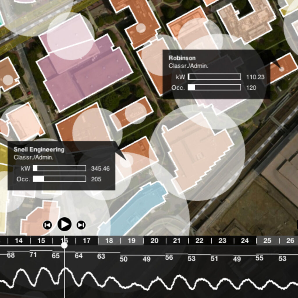
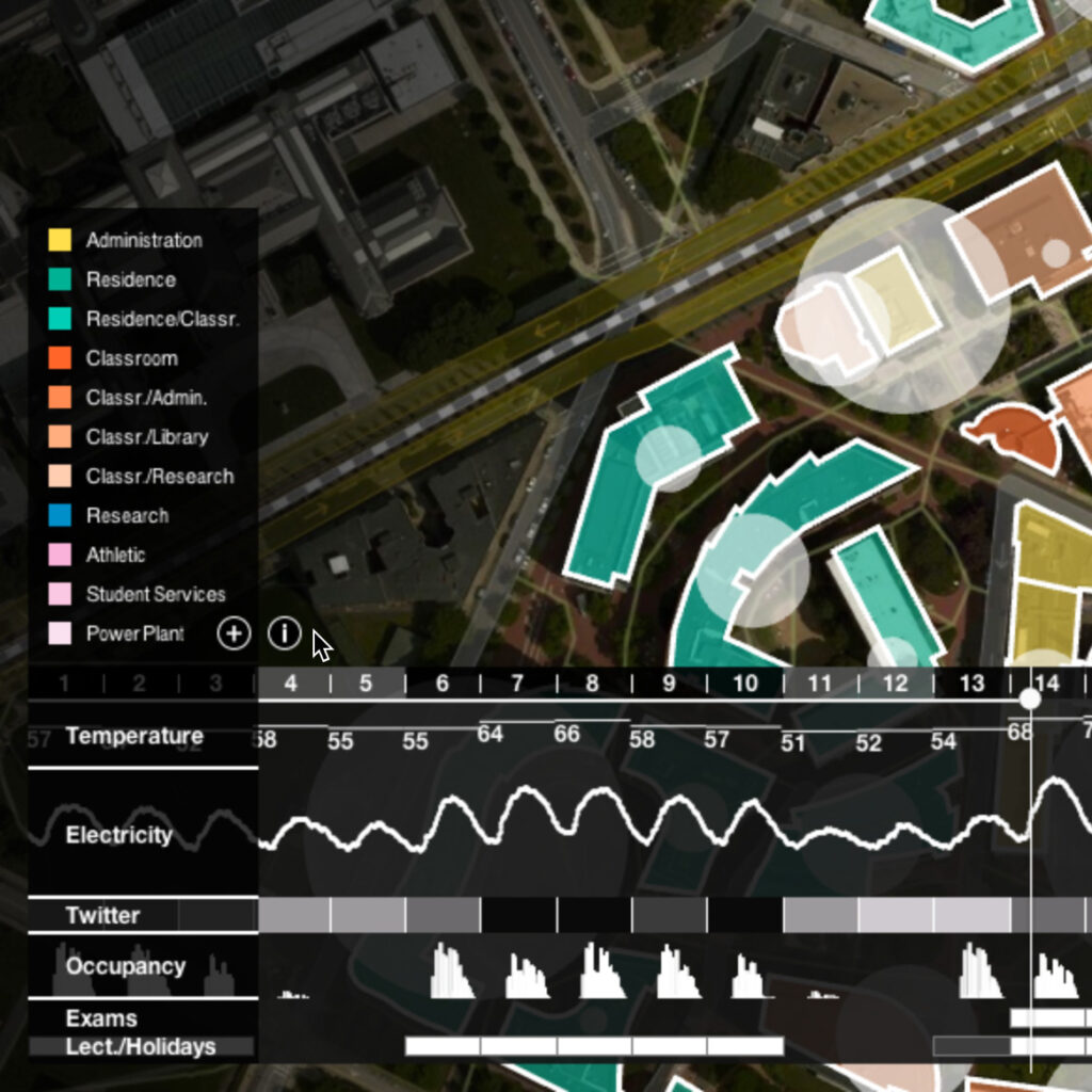
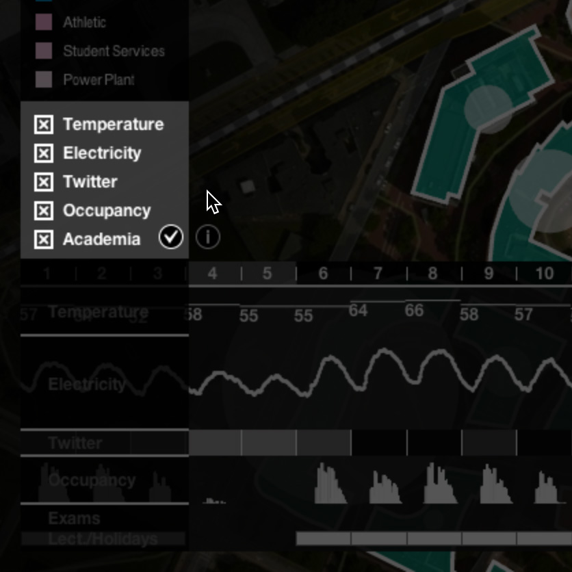
3) Map area: The map area shows the geographical map with campus buildings indicating the predominant use type by color. Overlaid on top of these buildings are the building-level indicators for electricity use and by opening a pop-up label, building level classroom occupancy data can be observed in addition. The electrical load indication can be toggled between two different values: building load at 15 minute intervals in kW, load normalized over square-feet of building surface in kW/sq ft.
Using the geographic map as an entry point emerged as valuable from conversations with the campus energy group. Operators are extremely familiar with the location of buildings within the campus space and conceive of a number of campus wide systems through their spatial structure.
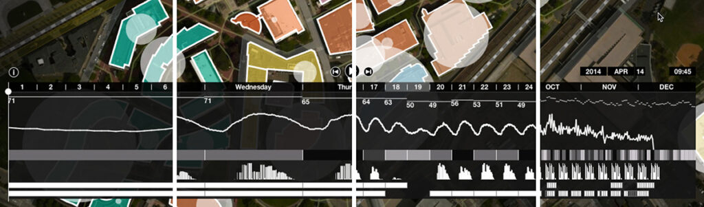
4) Time line and temporal scale: The primary entry point for the user is the interactive timeline which informs about the time associated with the represented data and indicates the time range the data will be looped through. By changing the zoom level of the timeline (day, week, month, year), the user also determines the temporal level of aggregation displayed. By interacting with the timeline and with the data indicators on the right side of the time line, the temporal scale can be changed providing views of the following time ranges: year, month, week, day. The objective of this is to allow the exploration of patterns and dynamics related to daily and weekly cycles, as well as to seasonal and semester related changes.
At the prototype’s current state, the hope is to enable a broader audience to explore large amounts of systems data from diverse sources on energy consumption and social/environmental factors will facilitate greater awareness, understanding and ultimately better decision making for the optimization of energy usage.
Principal Investigator: Kristian Kloeckl
Research Assistants: Jeffrey Weng,
Mavez Dabas, Peyton Tiroff, Yuecan Fan, Corey Hoard
with technical support from:
Northeastern University Energy group, Registrar’s office, Marketing and Communications office.