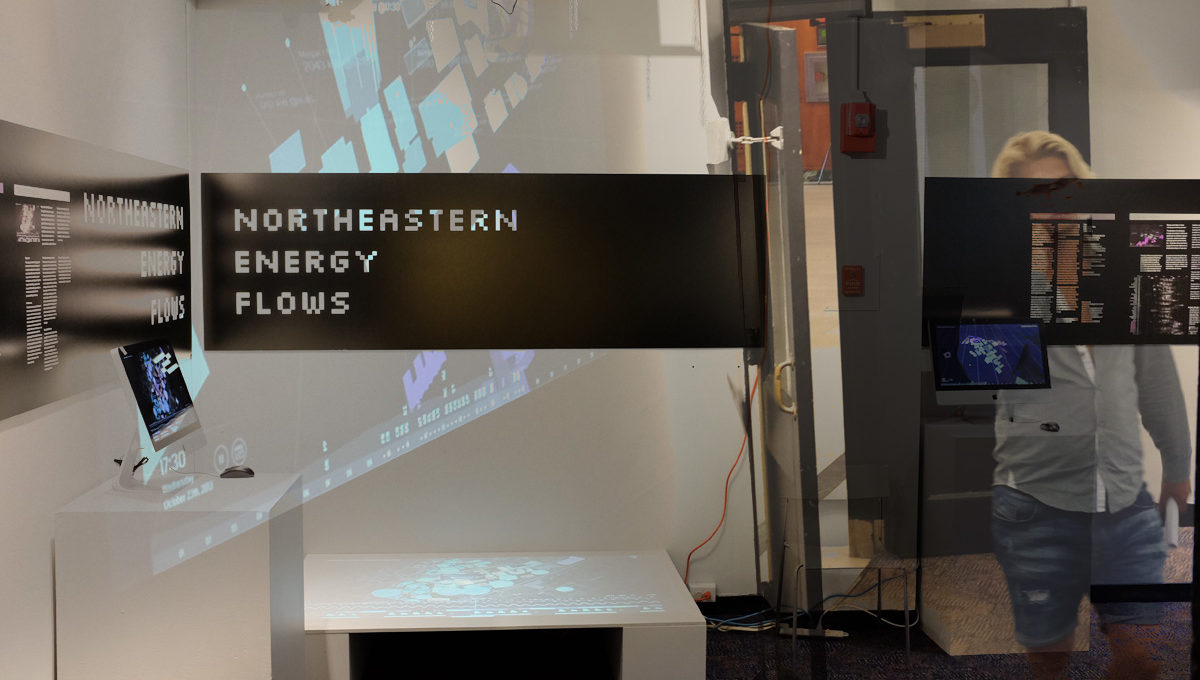
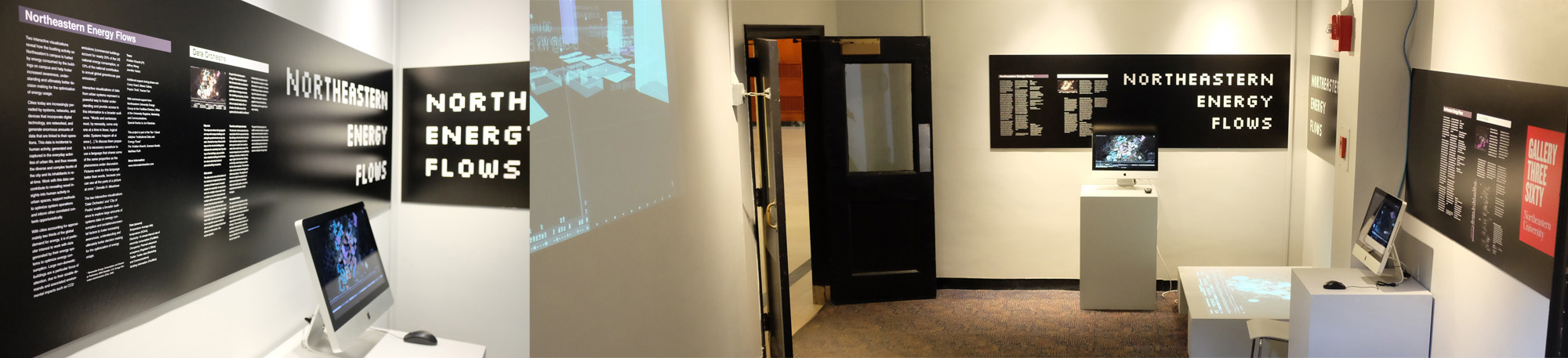
Two interactive visualizations reveal how the bustling activity on Northeastern’s campus is fueled by energy consumed by the buildings on campus and help foster increased awareness, understanding and ultimately better decision making for the optimization of energy usage.
The exhibition is on show at Gallery 360, Fri, July 15, 2016 – Sun, September 18, 2016.
City of Peaks
Did you ever think of cities waking up and falling asleep?
The behavior of a building’s energy consumption reflects aspects such as activities happening inside, ambient conditions, building systems performance, etc. As people arrive and leave, equipment is used, lights are on, temperature drops or rises and building systems such as AC or heating perform their functions, a building reflects all this in the rate at which it consumes energy. At a certain time every day, the rate of energy consumption of each building reaches a peak, that is when it consumes at a higher rate than both before and after that time on the same day.
The City of Peaks visualization focus- es on the daily peaks of electricity consumption of the buildings on Northeastern’s Boston campus. Buildings extrude vertically at the time of their peak and to the level of their peak value, leaving behind an information label as a trace. At the ground level, the building 2D shape changes in opacity according to the current rate of a building’s daily elec- tricity consumption (transparent: relatively low consumption, opaque: high consumption – relative to a building’s daily min and max values).
The activities a building hosts are one of the aspects that influence electricity consumption behavior and peak time. Try to observe differences in peak times between residential buildings (purple) and others (white) that house classrooms, offices, etc.
The area chart above the time line shows overall aggregate campus electricity consumption and indicates each building’s peak by its letter code.
The time line can be dragged up to reveal a drawer containing detailed consumption curves for all buildings.
Time does not move uniformly in the City of Peaks, but follows event time. It speeds up between peaks and slows down when peaks occur.
Data Orchestra
This visualization system provides access to fine grain data on energy consumption, building occupancy, climatic conditions and social activities. Like a musical notation for orchestra, the data rows of the system (like the staffs for different instruments) in conjunction with the map allow to explore multiple dimensions in parallel. This helps in obtaining a deeper understanding of the dynamics related to energy consumption, foster engagement across disciplinary boundaries and to support decision making.
The two interactive visualizations ‘Data Orchestra’ and ‘City of Peaks’ enable a broader audience to explore large amounts of systems data on energy consumption and social/environmental factors to foster increasing awareness, understanding and ultimately better decision making for the optimization of energy usage.
Team
Kristian Kloeckl (PI), Jeffrey Weng, Jennifer Heintz
Additional support during phase one:
Corey Hoard, Mavez Dabas, Peyton Tiroff, Yuecan Fan
With technical support from
Northeastern University Energy Group at the Facilities Division, Office of the University Registrar, Marketing and Communications.
Special thanks to Joe Ranahan.
This project is part of the Tier 1 Grant initiative “Institutional Data and Energy Flows”
PIs: Kristian Kloeckl, Guevara Noubir, Matthias Ruth